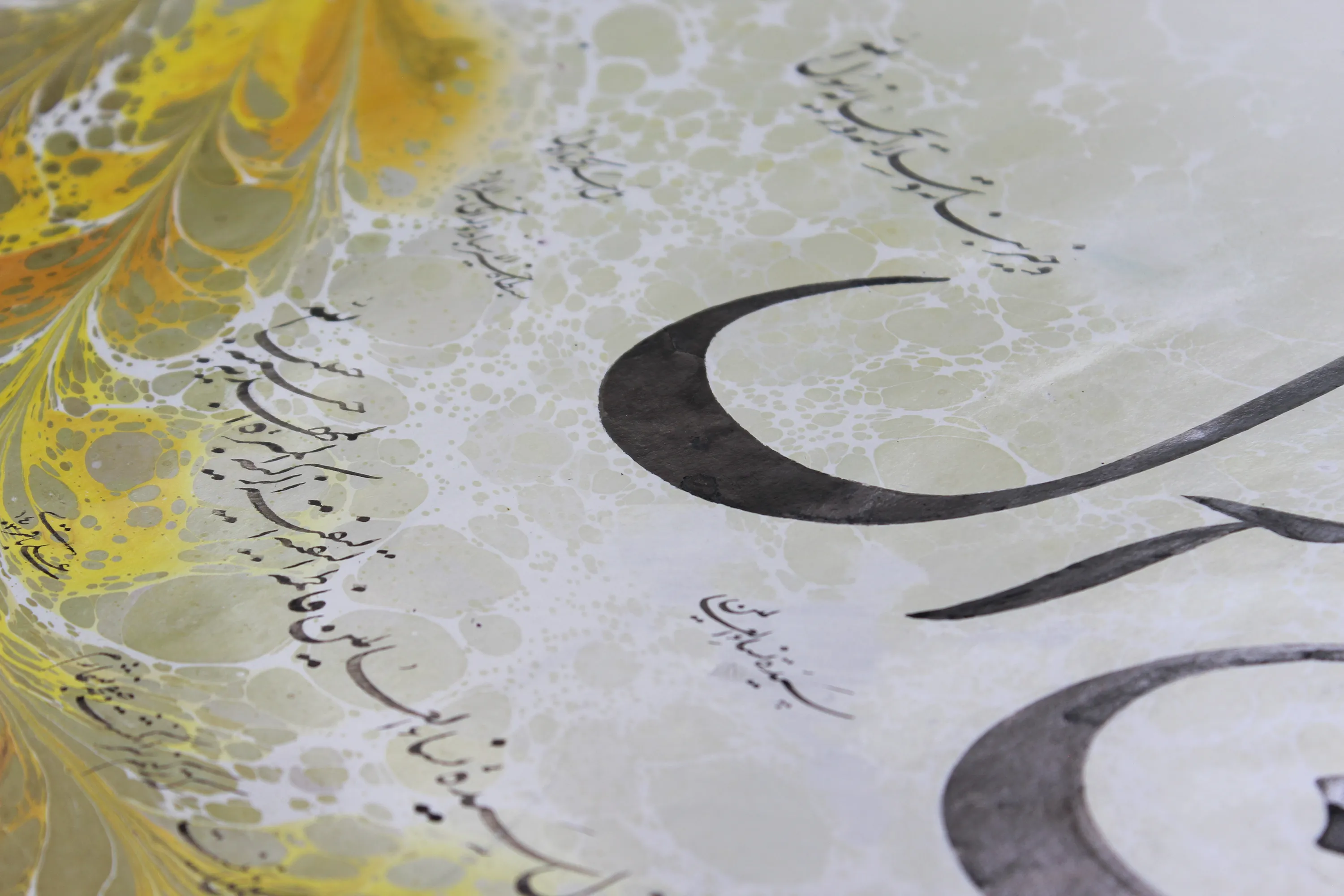
What Is Nastaliq?
A Look at Its History, Form, and Uses
Nastaliq is sometimes described as a script, an alphabet, or even a kind of font, but none of these definitions is precise on its own. Nastaliq is, fundamentally, a style of calligraphy: a historical, rule-based method for shaping letters and words and for arranging their relationship with the line and the space of the page.
The style gradually emerged in the cultural sphere of Iran during the second half of the eighth century AH, corresponding to the fourteenth century CE. Flowing curves, the relative shortness of certain vertical elements, carefully measured elongated strokes, variations in the thickness of the pen trace, and the way words are positioned within a line all contribute to its visual character.
Nastaliq became deeply connected with Persian poetry and the art of the book, but its history is not limited either to poetry or to the geography of present-day Iran. To understand the style, it is useful to look at its form, its uses, and the path it has followed over several centuries.
(Yousefi, “Calligraphy,” Encyclopaedia Iranica; National Museum of Asian Art, Nastaliq: The Genius of Persian Calligraphy)
Nastaliq Is a Calligraphic Style, Not a Language or Alphabet
To define Nastaliq clearly, we first need to distinguish between three things: language, writing system, and calligraphic style.
Persian is written using the Perso-Arabic writing system. The same letters can be rendered in different calligraphic styles, including Naskh, Ta'liq, Nastaliq, and Shekasteh Nastaliq.
The Persian word khat makes the matter slightly more complicated because it can carry several meanings. It may refer to a writing system, to an individual's handwriting, or, as in khat-e Nastaliq, to a particular calligraphic style.
In Nastaliq, the concern is not simply beautiful handwriting. The shapes of the letters, the proportions between their parts, spacing, connections, the position of words, and the empty space of the page all affect the final result. For this reason, the same poem or phrase written in Naskh, Nastaliq, or Shekasteh produces a very different visual experience.
A Nastaliq font should not be confused with Nastaliq itself. A font is a digital attempt to represent the letterforms and connections of this calligraphic style. It may recreate many of Nastaliq's visual characteristics, but digital typesetting and writing by hand with a calligraphic pen are two different processes.
Why Is It Called “Nastaliq”?
The name Nastaliq is usually explained as a combination of the names Naskh and Ta'liq. This etymology also appears in specialist sources, but it can create a misleading impression: that Nastaliq was created at one specific moment simply by combining these two styles directly.
Historical evidence suggests a more complex picture.
The emergence of Nastaliq appears to have been a gradual process. Certain features that later became established characteristics of Nastaliq can already be seen in earlier and transitional examples, where they gradually acquired greater order and a more distinct identity.
The name Nastaliq may therefore remind us of its historical relationship with Naskh and Ta'liq, but understanding the style itself requires closer attention to its structure and visual characteristics.
(Yousefi, “Calligraphy”; Sedaghat Jabbari, “The Formation and Development of Nastaliq Script in the Eighth and Ninth Centuries AH”)
How Can We Recognize Nastaliq?
Nastaliq cannot be identified by a single feature. Its identity emerges from a combination of characteristics: the way words sit on the kursi or notional baseline, the forms of the letters, the movement of curves, elongated strokes, variations in pen thickness, and the relationship between the writing and the surrounding white space.
The Kursi and the Movement of the Line
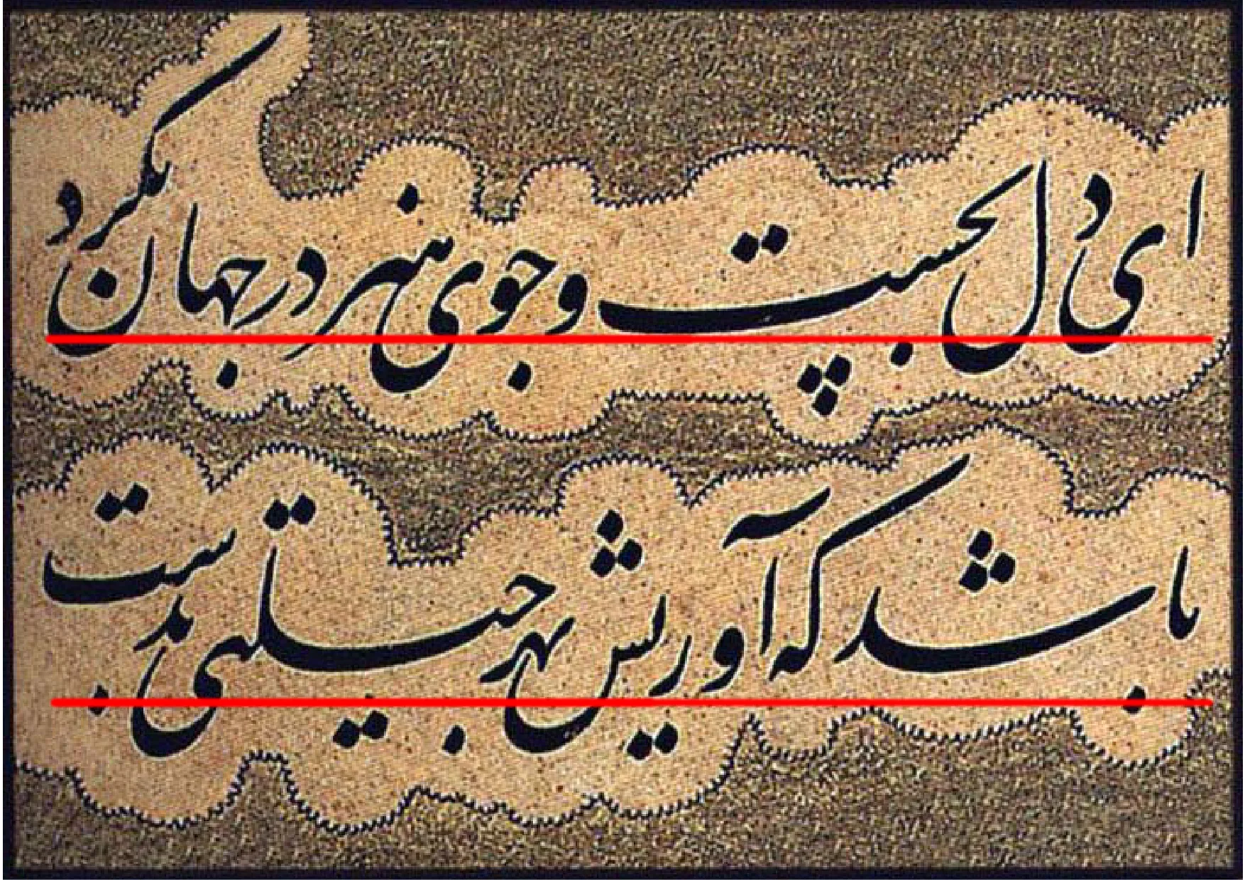
In calligraphy, the kursi is the imaginary path along which letters and words are positioned within a line. It is not necessarily a line physically drawn on the paper; rather, it is a reference for understanding how the elements of the writing are arranged in relation to one another.
In Nastaliq, words do not always sit on a fixed horizontal line. Part of a line or hemistich may rise, descend, or move along a diagonal. These changes in height give the line a sense of movement that is an important feature of Nastaliq's appearance.
Curves, Verticals, and Elongated Strokes
Curved movements are especially prominent in Nastaliq. The turns and arcs of the letters make the movement of the writing appear more continuous across a word and along the line.
Vertical elements also exist alongside these curves, but some of them are shorter than in many examples of Naskh. This relationship between height and curvature contributes to the visual distinction between the two styles.
Elongated strokes are not simply used to fill empty space. An elongation can create distance between two dense areas, alter the direction of a line, or contribute to the overall balance of the composition.
Letterforms do not always function independently of their surroundings either. A letter's position within a word, the kind of connection it forms, and its place within the composition can all affect how it is executed.
For an introductory identification of Nastaliq, it is therefore better to look for a combination of signs: changes in word height, curved movement, the relative shortness of certain verticals, measured elongated strokes, variations in pen thickness, and the use of white space.
How Does Nastaliq Differ from Naskh, Ta'liq, and Shekasteh Nastaliq?
These styles are not historically unrelated, but each has its own structure and character. As a starting point, a few broad distinctions can help clarify their boundaries.
Nastaliq and Naskh
Naskh is one of the major calligraphic styles based on the Arabic script. In many examples, vertical elements are more prominent and the line tends to be arranged in a more regular and direct manner.
In Nastaliq, the movement of words generally appears softer and more curved. Variations in the height of letters and words, the relative shortness of some verticals, and the presence of diagonal elongations also give the line a different character.
These distinctions are useful only as a preliminary guide. The rules governing each style are far more precise than can be conveyed through a few visible features.
Nastaliq and Ta'liq
Ta'liq is an important historical style, particularly associated with scribal and administrative writing, and it formed part of the background from which Nastaliq emerged.
Nastaliq, however, cannot simply be regarded as a more orderly or “more beautiful” form of Ta'liq. Over time, it developed its own structure, systems of connection, and rules, becoming a distinct calligraphic style.
Nastaliq and Shekasteh Nastaliq
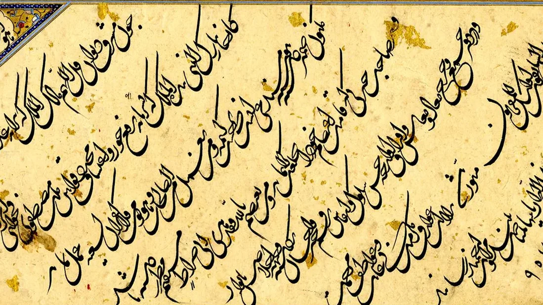
Shekasteh Nastaliq is a later style, characterized by more extensive connections and greater compression. The word shekasteh, meaning “broken,” does not imply something incomplete, irregular, or defective; it refers instead to a transformation in the construction and joining of letters.
As a result, not every slanted, quickly written, or highly dynamic example of Nastaliq can be called Shekasteh Nastaliq. The primary difference is not simply speed or visual density, but the underlying system of connections and the structure of writing.
Where Has Nastaliq Been Used?
Poetry, Literary Manuscripts, and Calligraphic Pieces
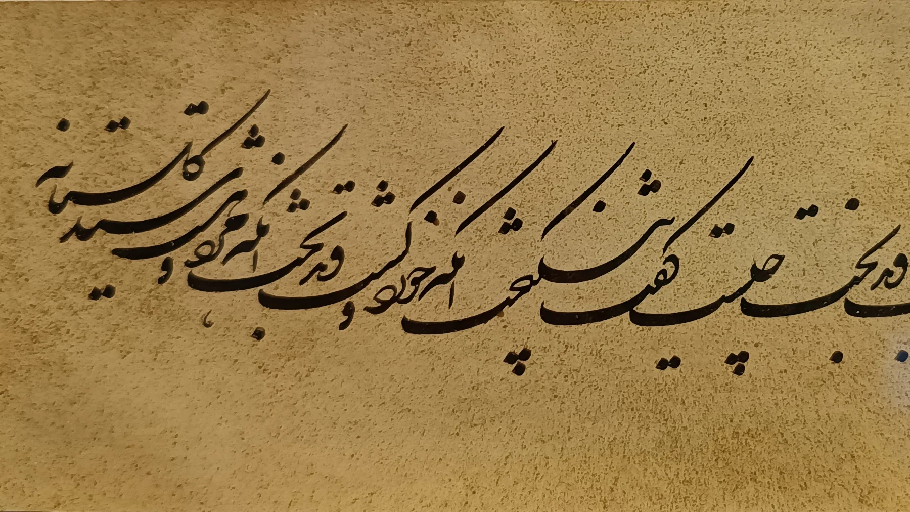
Nastaliq's association with Persian literature is one of the best-known aspects of its history. Manuscripts of works by Nizami and Saadi, along with calligraphic pieces containing poetry by Persian-language poets, show the important place this style held in writing poetry and in the art of the book.
The structure of Persian poetry also offers interesting possibilities to the calligrapher. The two hemistichs of a verse can move differently across the page, while elongations, spacing, and diagonal lines help organize the visual relationship between them.
This does not mean, however, that Nastaliq was created exclusively for poetry or that poetry was its only suitable use.
Its use also extended to prose, independent calligraphic pieces, albums, and certain kinds of documentary material.
(Yousefi, “Calligraphy”)
From Historical Iran to Central Asia and India
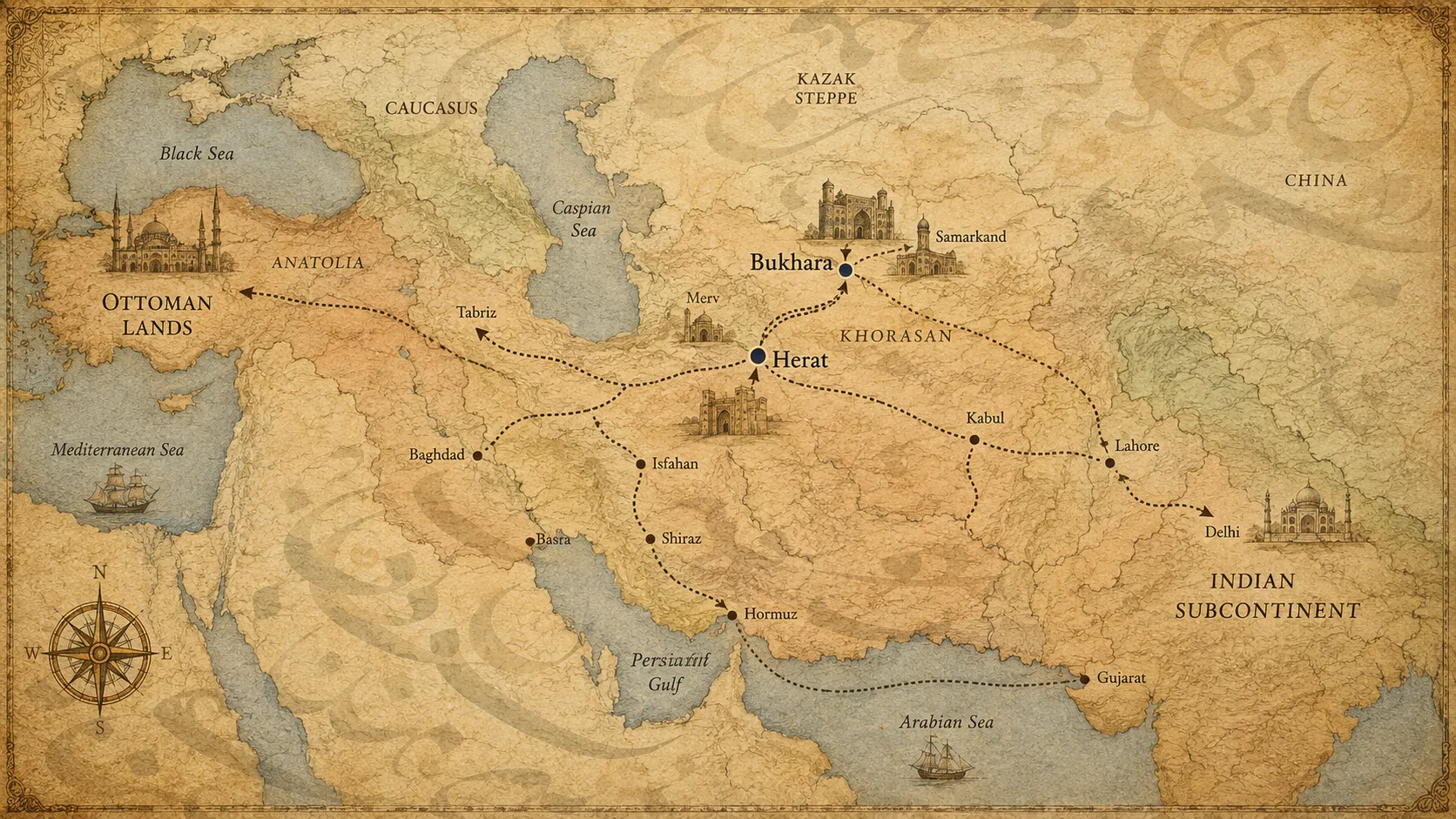
Nastaliq emerged within the cultural environment of Iran, but it did not remain confined there. The style spread through Khorasan, Herat, Bukhara, Central Asia, and the Indian subcontinent, and was also known in some Ottoman contexts.
(Yousefi, “Calligraphy”; National Museum of Asian Art, Nastaliq: The Genius of Persian Calligraphy)
Some calligraphic pieces written in Central Asia later entered albums assembled at the Mughal court in India. Such examples show that calligraphic works, like many other artistic objects, moved between regions and carried artistic traditions and practices with them.
When studying such works, it is important to distinguish between the date on which a calligraphic piece was written, the period when its borders or illumination were added, and the date when it was incorporated into an album.
Nastaliq also followed an important path in the Indian subcontinent and continued within the region's writing traditions. Its role in the Urdu language and its written tradition is a separate subject in its own right, but this geographical range alone shows that the history of Nastaliq cannot be sought solely within the political borders of present-day Iran.
How Did Nastaliq Develop?
A Gradual Formation in the Eighth Century AH
Specialist sources generally place the formation of Nastaliq in the second half of the eighth century AH, corresponding to the fourteenth century CE, within the cultural environment of Iran.
It is better, however, not to reduce this development to a single year or moment.
Studies of early examples have shown that features resembling Nastaliq existed before the works in which the style appears in a more established form. This supports the idea of a gradual formation, although the dating and provenance of some transitional examples remain disputed.
Both Tabriz and Shiraz are important in studies of this period. Existing evidence has led some researchers to view the formation of Nastaliq as a process connected with several cultural and manuscript-production centers in historical Iran, rather than as a phenomenon that can be attributed with certainty to a single city.
(Sedaghat Jabbari; Kardar-Tehran and Gholichkhani; National Museum of Asian Art)
Mir Ali Tabrizi: Inventor of Nastaliq or Its Systematizer?
The name of Mir Ali Tabrizi appears in almost every discussion of Nastaliq's origins, but here it is important to distinguish between the traditional account and more recent historical research.
In the traditional history of calligraphy, Mir Ali Tabrizi is described as the vazi', or originator, of Nastaliq. This view is reflected in historical texts and in genealogies of calligraphers.
More recent scholarship, taking into account earlier examples and transitional characteristics predating Mir Ali, has been more cautious about attributing the complete invention of an entire style to a single person. From this perspective, Mir Ali's role may be understood more in terms of organizing, codifying, and stabilizing a more clearly defined form of Nastaliq.
These two accounts do not necessarily answer the same kind of question. The traditional narrative tells us how later generations of calligraphers understood Mir Ali's place in their history, while modern historical research attempts to reconstruct the development of Nastaliq through the study of manuscripts and dated works.
A more precise formulation, therefore, is this: within the calligraphic tradition, Mir Ali Tabrizi is recognized as the originator of Nastaliq, while newer research tends to examine his role primarily in the systematization and consolidation of the style.
(Qazi Ahmad, Calligraphers and Painters; Yousefi, “Calligraphy”; Sedaghat Jabbari)
A manuscript of Nizami's Khosrow and Shirin bearing the signature of Mir Ali Tabrizi is an important work in this discussion. The National Museum of Asian Art dates the manuscript to around 1400 CE.
From Herat and Sultan Ali Mashhadi to Mir Emad
The story of Nastaliq did not end with its initial formation. During the ninth and tenth centuries AH, the style developed in centers such as Herat, and various calligraphers contributed to its refinement and continuation.
Sultan Ali Mashhadi is one figure whose works clearly demonstrate the organization of the line, controlled variations in pen thickness, and the placement of words at different heights.
During the Safavid period, calligraphic pieces by Mir Emad Hassani also provide clear examples of the relationship between elongated strokes, diagonal lines, the density of words, and white space.
The history of Nastaliq, however, neither begins with Sultan Ali nor ends with Mir Emad. They are simply two well-known examples within a much longer path shaped and continued by many calligraphers.
(Yousefi, “Calligraphy”; National Museum of Asian Art; The Metropolitan Museum of Art)
Nastaliq and the Persian Written Heritage
The importance of Nastaliq is not limited to the beauty of its letterforms. A significant part of the Persian written heritage, from literary manuscripts to individual calligraphic pieces and albums, was written in this style.
When we understand Nastaliq more fully, looking at an old manuscript no longer means simply reading its words. We also begin to notice the shapes of the letters, the movement of the lines, spacing, the scale of the writing, and the relationship between the text and the space of the page.
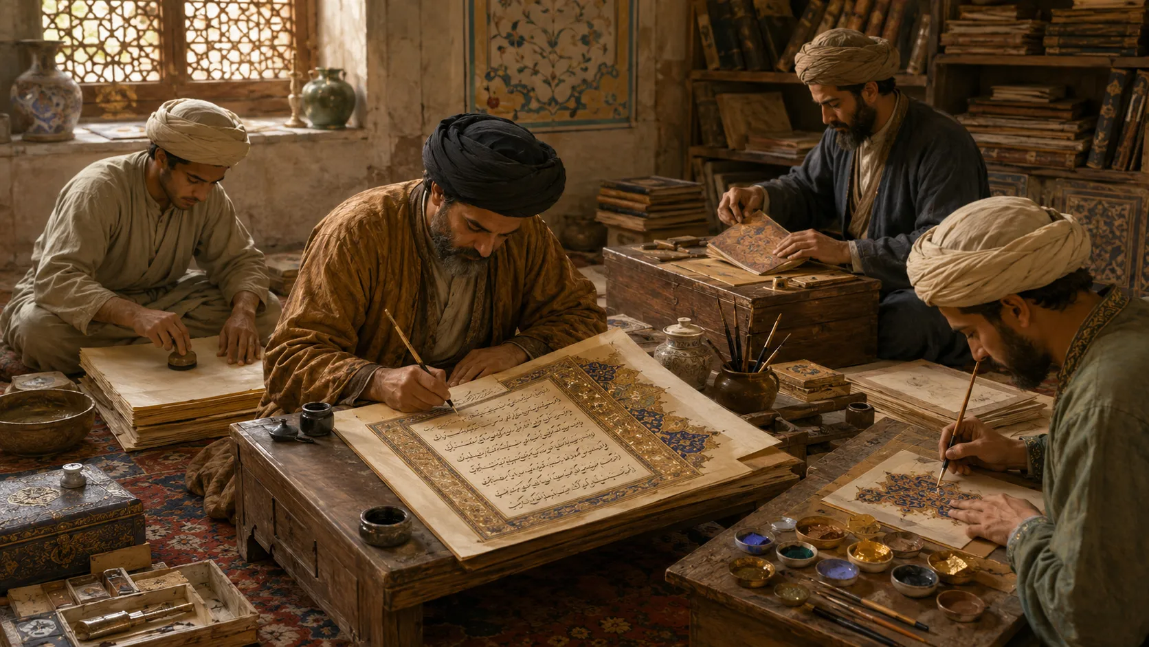
In such works, calligraphy is not merely a vehicle for transmitting a text. The way the text is presented is itself part of the experience. How the writing is placed on the page, its scale, and the way it relates to illumination, page design, or borders all help us see the work more completely.
Perhaps this is one of the best ways to approach Nastaliq: not simply as a set of rules for forming letters. Nastaliq is the result of a relationship between letter, movement, space, and text, a relationship shaped over several centuries that has accompanied a major part of Persian visual and written culture.
Discussion · article
0